Packaging Great Grapes


PURPOSE
PURPOSE
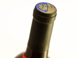
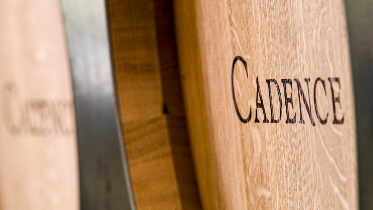
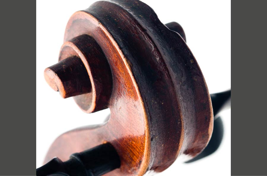
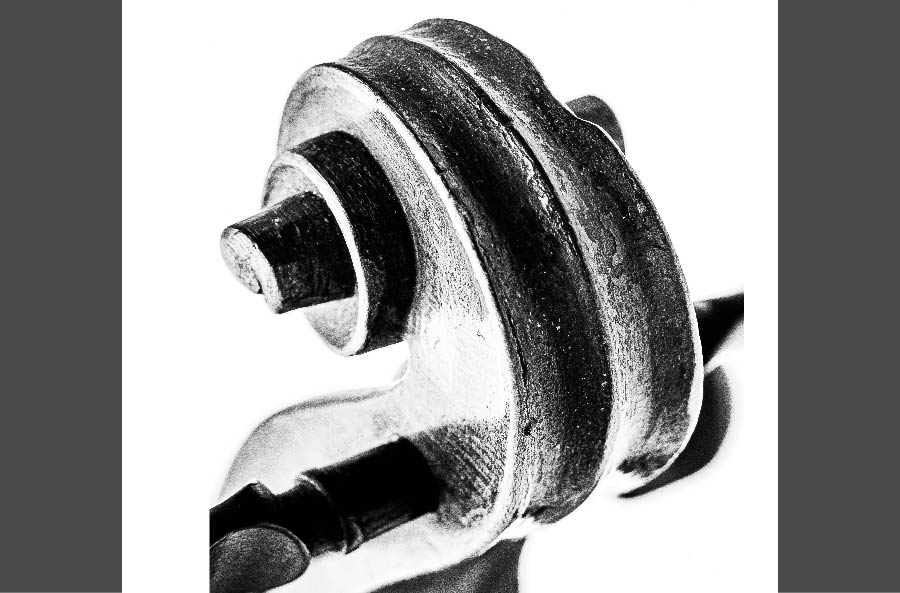
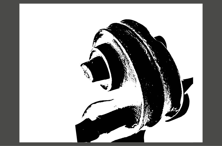
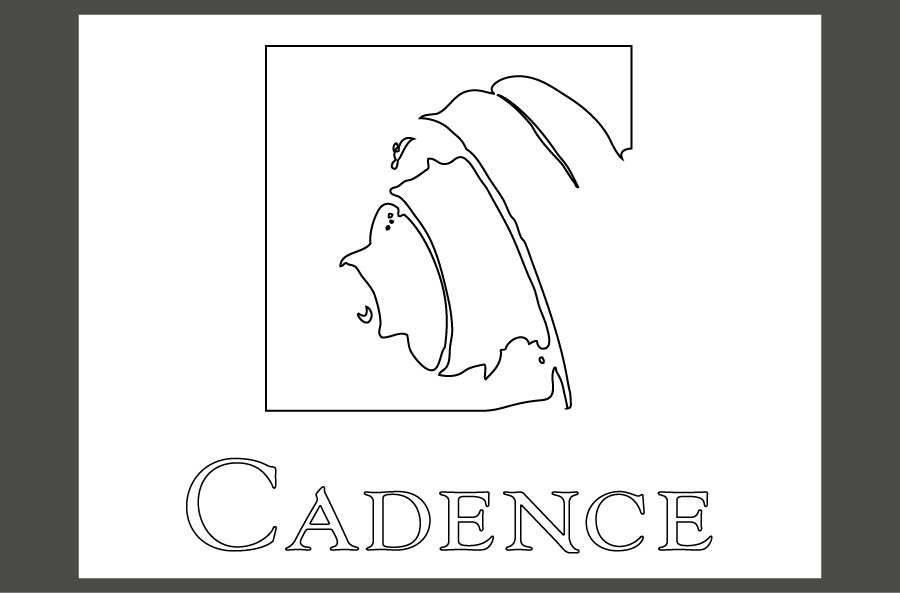
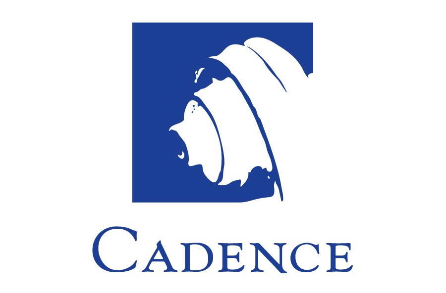
Before developing a common motif to build the company's brand around, we took a clinical look at their history, projections of where they'd like to be in 5-10 years, their relationship with wine media and loyal customers, and most importantly, themes close to the owners. Ben and Gaye are musical (huge fans of Classical) and crazy about biking, the visual metaphors we played with tended to revolve around strings, instrumentation, motion (playing off a literal 'cadence'). We finally resolved on a violin scroll as the best visual representation, and metaphorically appropriate since it's the tuning part of the instrument (plus it's beautiful).
Before developing a common motif to build the company's brand around, we took a clinical look at their history, projections of where they'd like to be in 5-10 years, their relationship with wine media and loyal customers, and most importantly, themes close to the owners. Ben and Gaye are musical (huge fans of Classical) and crazy about biking, the visual metaphors we played with tended to revolve around strings, instrumentation, motion (playing off a literal 'cadence'). We finally resolved on a violin scroll as the best visual representation, and metaphorically appropriate since it's the tuning part of the instrument (plus it's beautiful).


APPROACH
APPROACH
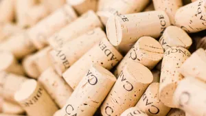
Packaging retail products are similar to designing posters, each label conveys an immediate graphic impression and then has to impart varying pieces of hierarchical information. The goal is always to keep visual emotions running high and close to the company message while having text and secondary graphic elements support that initial visual pop and fill in the technical side.
Packaging retail products are similar to designing posters, each label conveys an immediate graphic impression and then has to impart varying pieces of hierarchical information. The goal is always to keep visual emotions running high and close to the company message while having text and secondary graphic elements support that initial visual pop and fill in the technical side.
RESULTS
RESULTS
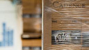
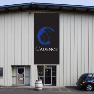
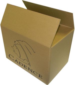
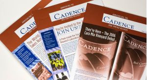
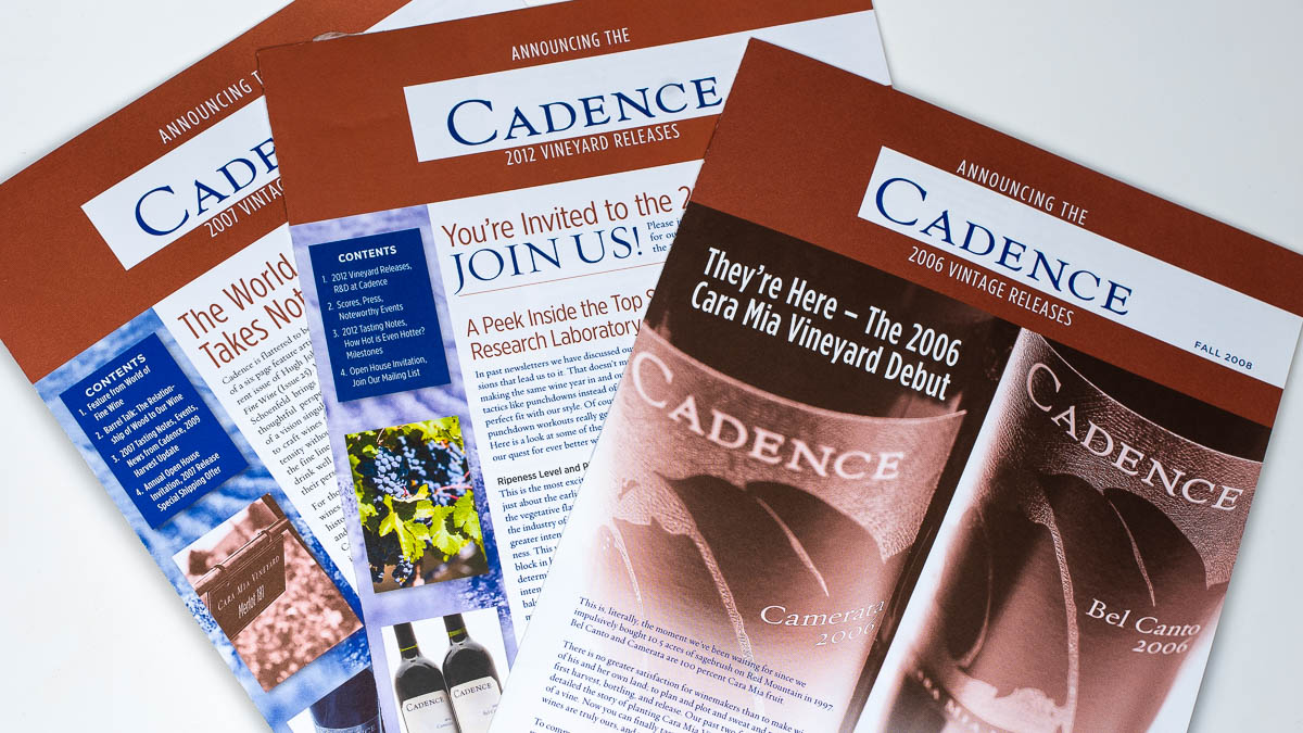
A prestige winery is branded from labels to cartons to sales kits to advertising to (even) bike jackets and coasters.
A prestige winery is branded from labels to cartons to sales kits to advertising to (even) bike jackets and coasters.